Friday, 20 August 2021

Life is Better with ART in it by Charmane Koch

 Love my title? Life is definitely better with ART in it! Especially these days! It definitely has helped me through tough times! Nothing better than some "Art Therapy"!

Looking at ART makes me happy too! I am loving the Street Art around Adelaide that I have been seeing as we explore our own city!

Today I am sharing with you a layout that I have been slowly creating over the last few weeks...

I wanted to create a similar feel to the actual photo of Street Art that I happened to find while walking past a backstreet in Adelaide!

I started off by colouring White Gesso with Rainforest Colour Spray, I have then used the Drifting Leaves stencil around the 4 corners of the White Cardstock. With the left over Gesso I have smeared with a palette knife lightly over the rest of the page. I have then dried using a Heat Gun.

Next I have then used a palette knife to stencil the Rose Reveal Stencil with White Gesso...

I've waited for that to dry naturally {or I was too busy and couldn't continue!}

Meanwhile I have torn some cardboard from a box and painted with Gesso to use as a backing to my photo.

After that I have decided to use the Brickwork from the Pavement Stencil in the middle of my page to create the similar brickwork on the wall. I've used White Gesso again & dried with a Heat Gun.

Once everything has dried I have slowly coloured the Rose Reveal Stencil using Apple of My Eye & Blush Mica powders with a splash of water. I have also used Leather Mica Powder to colour the brickwork. This has been done in layers until I was satisfied with the colours.

I also stamped using the script on the Bokeh stamp lightly over the top in places on my layout to create a "graffiti" effect like on the door of the photo.

I have doodled around the edges of the stencilled background, so that the images are highlighted a bit more.

I have layered the photo using the cardboard, I coloured part with the left over Apple of my Eye Mica powder.

I have then added a swirl of kitchen string and flowers to add extra interest. And of course a Charms Creations Heart to match.

Thanks for popping by, I hope I have inspired you to create your own background using a stencil or two ;)

XO Charm


Wednesday, 18 August 2021

Embrace Change - Card 1 by Tracy Jackson

 Hello Bee Arty fans

Luckily my DT parcel arrived late last night filled with new collections that I haven't yet had a chance to play with... And I say luckily because we now have delta covid on our New Zealand shores and have gone into snap lockdown, and this parcel arrived in the nick of time considering I had nothing left! LOL

So over the next few posts I do I will be doing 3 cards using the cut out from Embrace Change Collection designed y Fiona Paltridge


I sat down and cut all the pieces out


I then picked out the background called Spice I was going to use for all 3 cards, - I then put two aside for a later date so I could finish the first card


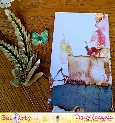
I picked out the fern like greenery and butterfly, but felt like it needed bit more so hand tore the left over paper then inked the edges


Placed and glued them down using Art Glitter Adhesive


Glued down the butterfly, and picked out a word from Poetry which I wanted to use, inked all edges and mounted onto a white card


The longest part of the whole card is to fussy cut the images. But when you have sore eyes and are giving them a break from colouring or aren't confident in colouring, this is the perfect solution.

I going to work on the next couple cards during lockdown..

Until next time, stay safe..
Happy crafting

Sunday, 15 August 2021

Road Trip Sneak Peek II - With Karyn Schultz!

  Hi Bee Arty Lovelies!

It's Karyn here and today I have a Sneak Peek of another one of my creations that will feature in the upcoming  Bee Arty Road Trip kit. This sneak is from a scrapbook page titled "Let's Hit The Road".
 
 
  Road Trip has a grunge/watercolour beachy colour palette with versatile elements, and is designed by the talented Michelle Grant. You will love this collection - the stamps, stencils and dies are not to be missed! You can subscribe to the kit here. Kits come with a paper pack, stencils, metal dies, stamp sets, embellishments and full colour kit instructions.


Thanks so much for stopping by

Crafty Hugs xx


Saturday, 14 August 2021

Dream, Believe, Achieve by Tracey Campbell

Hello everyone, Happy Saturday. Today I am sharing my latest creation using the Find Paradise Collection by Fiona Paltridge, it a lovely collection that has soft touches of pink/peach and minty green shades. Perfect for those dreamy photos of photos of your favourite holiday in a tropical setting. 
I've picked a photo of my oldest daughter Bronte and one of her friends that she doesn't get to see very often but when they do meet up it is like that just saw each other. A sign of a true friendship.

Dream, Believe, Achieve


I wanted to add a contrasting colour to the beautiful colour scheme of Find Paradise so that it would pop out. I had no idea of which colour to use so I decided to look at a colour wheel and see what the triadic colour would be. A triadic colour scheme is comprised of three colours evenly spaced on the colour wheel (you can also use the in-between hues). Because of the strong contrast, a triadic palette is generally quiet dramatic, but by using toned down shades it cuts the colour down to manageable (visually pleasing) levels.  In the wheel below you can see that the peachy/pinks would sit in the "Orange" triangle - I think about hues 2 and 5. The mint/green would sit in the "Green" triangle - hues 9 to 7. So I looked at the triadic colour and looked at the Violet and Blue Violet colours - at first I was thinking the higher number hues 6 - 9 but as I was playing around with colours I decided to go with an extreme contrast. So I picked a Blue Violet colour with the hue of 1. I like how it has turned about, you will have to let me know what you think. 


After I picked the contrasting colour I went through my Bee Arty Colour Blast products to see what I had and found. I found Just Blue and Royalty in the Shimmer Cubes and Indigo Colour Spray. I cut out three of the larger floral blooms from the Botanicals patterned paper and painted them with a waterbrush with the Just Blue and Royalty in the Shimmer Cubes and Indigo in the Colour Spray.


Next I fussy cut the peach blooms, 3 of the palm leaves and the painted large blooms from the Botanical patterned paper.


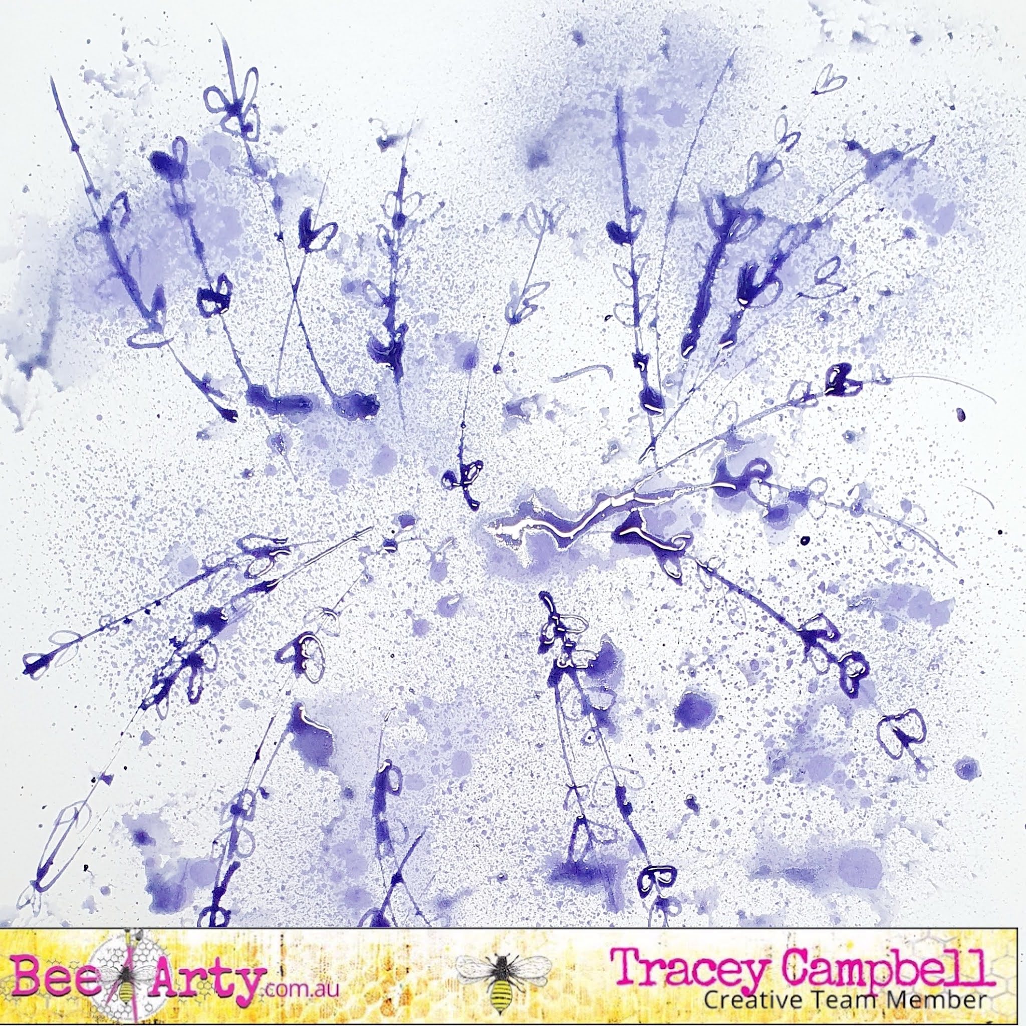
I wanted a pieces of paper the same as my contrasting blooms are, but didn't have any so decided to create my own. First up I sprayed some Indigo Colour Spray onto a piece of white cardstock, I wanted a fine spray and a large dotty/splatter look and to do this I sprayed the cardstock normally a few times, which creates the fine spray. Then I pushed the head of the spray very slowly, this techniques gives you larger drops/splats of stray.  


At this stage I didn't like how it looked so while it was still wet I used the plastic packaging technique to spread the larger splats out.


I then took the head off the Indigo Colour Spray and used the straw to draw random lines on the cardstock and then little leaves on the lines. I was copying the look of the lines in the wreath on the Mystic Garden pattern paper. 


Here is what is the cardstock for my mat turned out like.


Once dry I used the contrasting cardstock to mat the photo.


I decided to actually use the Mystic Garden pattern paper as the base of my layout but once again decided I need to add the contrasting colour. So I grabbed the purple Life of Colour paint pen and mimic the look of the wreath in the design. I drew large purple circles and then added a few little leaves and dots.


Here is what it looked like after I had finished mimicking the wreath. 


Next I adhered the matted photo down, however before i did I wanted to soften it a bit so I added tissue paper behind the matted photo. 


I still thought that the design was still too hard so I added some bandage fibers to the base to soften it and add texture.


To adhere it I used some Dimensional Magic in drops so that they formed clear balls that mirror the look of an acrylic dot. Here is a close up. Tip: make sure that you leave them long enough to dry (I left mine over night) or they can smudge. 


Next I arranged the fussy cut blooms and leaves over the left side and bottom right corner of the layout. 


I used 3 dimensional tape to add depth and adhere the fussy cut images to the page.


To finish off the page I fussy cut a title from the Breath pattern paper and adhered just off the top right hand corner of the photo. 


Here is the final layout. I really like the colour scheme, soft with a touch of pop.


I hope that I have given you some ideas and inspiration. 

Hugs
Tracey


Thursday, 12 August 2021

Grungy Tag by Aditi Mahajan

 Hello everyone,


Today I'm sharing with you all a mixed media style grungy tag. I've combined different collections and elements for this tag. As always, I love creating simple yet effective things, that aren't time consuming. 


Here's a look at the tag


I started it of with a pattern paper for the base of my tag. I then used a background stamp and stamped with black ink, randomly. 


I then mixed the mica and shimmer powders with transparent matte paste and applied it through a stencil. While that was wet, I sprinkled glitter onto it. Once dried, I splattered colours on the background, for a rusty grungy effect. 


I coloured the die cuts the same way, fussy cut some elements and created a composition, gluing them. I finished it with a phrase to add meaning to my tag. 

Monday, 9 August 2021

FABULOUS DARLING!! by Linda Pearson

Hi Bee Arters... welcome to my post and hope you are inspired to have a play with the new Colourblast fluoro products.


In this art journalling project I chose to use the new Fluro colour paste products from Bee Arty. 
This page was created in a Dina Wakely multi-media art journal (burlap) but a 12x12” black cardstock could be substituted to turn this page into a scrapbook layout very easily.

Bee Arty products used in creating this project:
White Cardstock 350gsm 12”x12” (10 Pack)
x-press it double sided tape 2mm thick
Art Glitter Designer Adhesive - all sizes
Organised Chaos A4 stencil - ‘Fearless Brave and Free’ collection designed by Fiona Paltridge
Flowers Metal Die ‘Untangle’ collection designed by Tanya Froud
String Leaves Die – ‘Grateful Heart’ collection designed by Michelle Grant
Butterfly Effect Die – ‘Butterfly Stardust’ Collection designed by Michelle Grant
Cool Words clear stamp set – ‘Fearless Brave and Free’ collection designed by Fiona Paltridge
Organised Chaos A4 stencil - – ‘Fearless Brave and Free’ collection designed by Fiona Paltridge
Positive 12x12 scrapbook paper - ‘Fearless Brave and Free’ collection designed by Fiona Paltridge (black and white off cut or similar could be used instead)
Mica powder – Fluro Pink, Fluro Green, Fluro Orange, Fluro Yellow (new product)
Gesso – white (mix the fluoro mica colours with gesso)

Black card
Fluro Pink, Fluro Green, Fluro Orange, Fluro Yellow acrylic paint
Black paint or ink for splatters
Die cut machine
Art journal
Muslin off cut
Black Archival stamp pad
Gelli plate and brayer
Fluro Pink Posca pen


Using the Gelli plate add a little fluoro green/gesso and some fluoro yellow mixes onto the gelli plate and spread over a sheet of white card.   I used A4 card, adjust accordingly to suit your purpose (Journal or scrapbook layout).  Place the Organised Chaos A4 stencil onto the gelli plate then spread black paint over the stencil.  Remove the stencil (rub off excess paint onto spare paper, wash the stencil).  Place the card onto the plate and rub to transfer the paint from the plate to the paper.  Allow to dry.


Cut the A4 card down to a 10x15cm tag size.  Outline the black marks and border of card using the Pink Posca pen.
 
Using another sheet of White Cardstock 350gsm, cut a 10cm strip off the sheet.  Colour the larger piece with fluoro orange gesso mix and paint the smaller piece with fluoro green gesso mix, dry off.  (no image)


Run the fluoro orange card through the die cut machine using the Flowers Metal Die as well as the Butterfly Effect Die then with the fluoro green card run the String Leaves Die through also.  Run the leaf from the Flowers Metal Die through with a small offcut of white card stock too.


I coloured an offcut of printed paper with a wash of fluoro pink paint adhere as a backing for a couple of the flower die-cut shapes.


On the stenciled background, the leaf die-cuts add some black spatters.


Go to town placing and adhering the die-cut shapes over the card.  I also added some muslin strips to the card to help the butterfly and flowers stand out a little.  Note:  I also added a strip of builders plaster tape to the backing card and a strip of the Positive 12x12 scrapbook paper. 


Stamp out the Cool Words clear stamp set onto a sheet of White Cardstock 350gsm.  Cut and edge the word cards with black archival ink pad.


Apply a liberal amount of fluoro pink/gesso mix loosely over the main substrate (DW art journal – burlap page in this instance).  Allow to dry.


Adhere the decorated tag to the black card cut to the desired size to suit your situation.  
Finally, add the words to the page also (I used mounting tape to lift off page).


Cheers and thank you for stopping by ...
Linda Pearson
linda@yourcreativepalette.com.au