Saturday, 7 July 2018

Shelf and chalkboard, by Amanda H

Hi all,

Who doesn't love a good Kmart hack? I took simple cheap Kmart items and transformed them into display pieces!

You may remember that last month I blogged about my "Create" sign, which I made for the Brisbane Papercraft and Scrapbooking Expo. I also made the shelf and chalkboard from Kmart items... you can see them in this picture of my display. Let me show you how I did it.


First K-mart hack - Altered shelf

I started with this K-mart shelf.

 I gave it a couple of coats of White Heavy Gesso.
Once dry, I stuck some gold foil washi tape on the edges of the shelf.
Next, using a script stencil, I added Colour Paste, in Deep Water to the shelf surface.
Next, for more interest, I grabbed a Stencil Girl stencil and added Colour Paste in Bling.
Then, with a nice wet brush, I painted some Colour Artist Inks, in Mermaid and Oasis to the shelf.
Finally, splatters of gold were added using my old Colour Shimmer Cube in Bling.
For the ropes for the shelf, I sprayed them with Colour Shimmer Spray in Bling, for a little sparkle.
I decided to make some interesting tassels on the ends of the rope at the bottom of the shelf. To two of these, I needed some arrows. They were silver charms, so I heat embossed them gold using Colour Embossing Powder in Bling.
 

And here is the final shelf.


Here are the tassels with gold embossed arrows.

Second Kmart hack - Altered Chalkboard

I started with the simple A-frame chalkboard from Kmart.
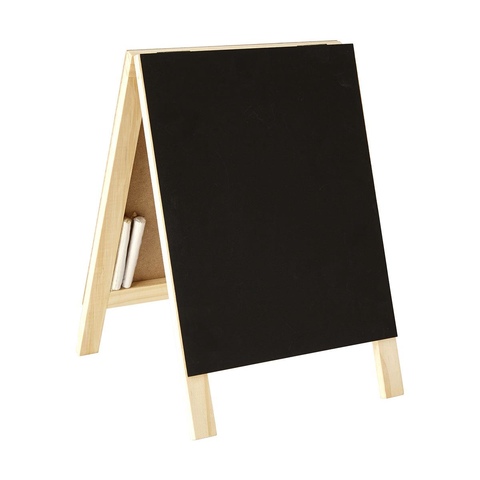
A-Frame Chalkboard
My first step was to use the Stencil Girl stencil with some Colour Pastes. I was sticking with green - yellow- turquoise colour themes for my display, so I used: Apple of my eye, Sunshine and Envy. I swiped the colours evenly through the stencil, and at some places the colours slightly mixed. But that looked great!


I also wanted gold accents, so I heat embossed a number of chipboard pieces using Colour Embossing Powder in Bling.

Here is the final chalkboard. You will noticed that after I stuck everything done, I added gold platters with my old Colour shimmer cube in Bling.

Here you can see I also heat embossed a leaf chipboard in green - Apple of my eye.

Full design on the back of the board. Awesome stencil!
  So many little details to pull my display together - and I loved the shelf and chalkboard addition.


Thanks for looking,
Amanda


Wednesday, 4 July 2018

"Take Me There" Art Journal Spread by Sue Plumb


Hi everyone!
Sue Plumb here to share my latest design team project with you. Today I am sharing a fun spread in my altered book art journal using Colour Artist Inks and Colour Paste. This page was inspired by the image of the hand holding the cocktail glass (those that know me, know how much I love a cocktail!); that I cut from a magazine advertisement. 


To create my page I began by roughly smearing some white heavy gesso across the book pages using an old gift card. I didn't go all the way to the edges of the pages, or worry about complete coverage as I wanted to show some of the original book paper.


I then added some colour to my pages using Oasis Colour Artist Ink, which I brushed on and then used a little extra water to move it around before using my heat gun to dry it off.


Once I had the base ink colour down, I wanted to add some contrast and texture using Fire Engine Colour Paste and a stencil from Flutterby Designs. I applied the paste through the stencil using a palette knife in 3 small areas close to the edges of the page; creating a "visual triangle" around where my focal image and words were going to be placed.


Once I looked at the red paste against the blue ink, I decided that it the contrast was too great, and I needed another colour to bring the two together. The obvious choice was a colour that met somewhere in the middle, so I looked for a shade of purple and chose Berry Colour Artist Ink. Again, I used a brush to apply the ink, dabbing it over and around the areas where the paste was to tie the colours together.


Once I had dried the background off, I added the large focal image that I had fussy cut from a magazine; along with the take me there quote that I had fussy cut from a Flutterby Designs Everyday Etc card; a Flutterby Designs sticker and a line of text from a magazine. I also added the fish and the (upside down) flower to the glass; then used a Stabilo All pencil to outline them all, before blending it with a water brush.


To finish my page I added some white highlights using a paint pen; some stamping using a roller phrase stamp and the Doodle Dots stamp from Viva Las VegaStamps. 


And last but not least, a single sweet little heart sticker.


That's all from me today, thanks for stopping by so I could share this with you. If you are an art journaler (or even if you aren't...yet); I would encourage you to keep an eye out everywhere for items you can use in your journal. (I keep a folder specifically for collecting things of interest that I find.)
Until next time, happy scrapping!


Tuesday, 3 July 2018

"Watch me Grow" Scrapbook layout + process video by Louise

Hi Crafters

Here is a bright, fun, easy to create page that I hope you'll have lots of fun creating.

"Watch me Grow"


For this page I've used the following

Colour Artist Inks Calypso
Colour Artist Inks Mermaid
Colour Artist Inks Soot

***

Firstly I've used a stencil and smoothed some White heavy gesso through it.
I focused on two different areas - the left side and right side and wanted a triangle kind of effect.


I left it to dry naturally overnight - a heat gun works also.
Once it's completely dry, I've dripped some Colour Artist Inks Mermaid and used water to help it move into the gaps  - some I want to soak into the paper and some will sit on the gesso.


Repeat the process with Colour Artist Inks Calypso.


Finally I added a very small amount of Colour Artist Inks Soot and again added some water to help it move.


I love how this background looks! The inks move so nicely around the gesso and are almost like watercolour. 


It's at this point that I wonder what to do next.
I'm looking at the layout thinking about the shapes I've used - hexagons, triangle (square/rectangle photo) - I'm only missing circles.
So I grab some empty toilet rolls and dip them in Black Heavy Gesso


With the little bit of left over Black Heavy Gesso I add some water and using a paint brush, add a couple of splatters around the page.


Finally I've added my photo - with paper cluster and title.
I struggled choosing a title and a position, but in the end, I love how the title suits the photo and has a lovely pop of contrast on the page.


***

You can see the whole process in the video below.


Thanks for visiting.
Happy Scrapping


Sunday, 1 July 2018

NEW Design Team 2018-2019

It is with pleasure that I announce our Design Team for 2018-2019. 

Our returning members are Suzy Loudon, Amanda Hartmann and Sue Plumb.  Kaye Halls will also be returning as the Design Team/Blog Co-ordinator.

Our new members are Chrissi Mannix, Anita Enright, Ros Aggett-Madley, Suzanne Franin, Kristy Abela, Charmane Koch and Michelle Henderson.

Welcome to you all!


"Amazing" by Melissa Struhs


Howdy again bloggers! We welcome the 
month with a brand new challenge for July...can you guess what it is?


This challenge is right up my alley as I generally only work on double page layouts and they always have a tonne of photo's incorporated plus any Colour Blast products...too easy! I began with some fabulous images from a night at the theatre and printed 5 of them at a 3x4 size.


I began with a brand new mandala stamp that I was itching to test run after a recent purchase.


With such an intricate pattern, I always reach for my stamp platform in case I need to re ink or restamp.


Several images were printed onto a textured watercolour paper with a Black Staz On ink.


In the meantime, I began to gather the chipboard and metal embellishments that would suit the mini print photo's. A beautiful pastel shade was needed and the Lovely Lilac Colour Embossing Powder


was added over the top a similar coloured chalk ink and heat set over a chipboard title and flourish as well as a metal mandala charm.


To add a little contrast to the intended layers, I reached for the Bling Colour Embossing Powder to dress up a lotus flower chipboard piece.


As I layered these pieces together, I started to see that a bolder splash was needed on the stamped images.


I began with testing some of the Colour Artist Inks and settled on Sunburnt and Rust, they had the rustic colours that were a bold contrast to Bling and Lovely Lilac.


3 images would eventually be fussy cut around but it doesn't really matter if you do it before or after you apply the colour. Using a small paintbrush, I splattered both colours randomly across the mandala's.


I dried them quickly with my heat gun and they soaked them with water from a spray bottle...this gave sections that remained but most of it ran and blurred and pooled.


While it was still wet, Bling Shimmer Spray was spritzed over the image as well. A little more heat to set the colours in place and I was happy with the exotic look.


Now, it was time to layer the elements together with the patterned papers and more metal filigree pieces. Once it was adhered into place, 


I added a little Bling from a Shimmer Cube to add a little splash of colour to the black cardstock edging.


The purple was divine, so I added a little Lovely Lilac Colour Paste over a stencil


to add some dots 


and diamonds in a scattered patch as well.


The chipboard title says it all...the production of Aladdin was just that and so colourful that it could inspire so many beautiful combinations of colours from our product range.


Be sure to take on the challenge this month...let's see how many of you love double page layouts as much as I do!
Till next time,
Mel.


Saturday, 30 June 2018

Farewell and Thank You

It is that time again - time to farewell some of our current Design Team!

These members have been a valuable asset to our team and have created many projects inspiring our customers - a big thank you to you all for your commitment and dedication to our team.

A special thank you to Melissa Struhs who has managed the Design Team and also been a very valuable contributor in many way - Melissa I thank you - your dedication and commitment is appreciated.

Thank you