Hello Bee Arty Hivers. Tracey Campbell here with you today on the blog showcasing my latest Creation Team project, a mix of Colour Blast products, teamed with some Bee Arty materials all of which is available in the BeeArty Store.
I have teamed these wonderful products with a recent photo of my two daughters, I was after a soft effect to complement the photo. It is rare moment in my daughters lives when they will pose together for photos, without lots of arguments.
I really wanted to have a flower wreath as the background for this layout but I wanted it to take up most of the 12x12 White cardstock but I didn't have one that was big enough. With this in mind I decided to use the A4 Devotion Stencil and create one by drawing a curve of a circle on the stencil and moving the stencil around in a circle on the page. (I used a black whiteboard marker to dot the circle curve so I could remove the mark later on). I used a clear gloss gel and a silicone palette knife to spread through the Devotion stencil.
I apologise for the photo below, it was difficult trying to take a good photo of clear gel medium on the white cardstock, I did edit the photo a bit to try and bring out the image so you can see the floral wreath and how it turned out. TIP: make sure as you move the stencil around to create the circle you have to wait for the gel medium to dry before over lapping the stencil.
Once the wreath was dry I used some Colour Artist Ink in Cranberry and Marine (I have the older Artist inks in little jars, they are now sold in little bottles with droppers on) with a dry brush and painted a large circle over the top of the floral wreath.

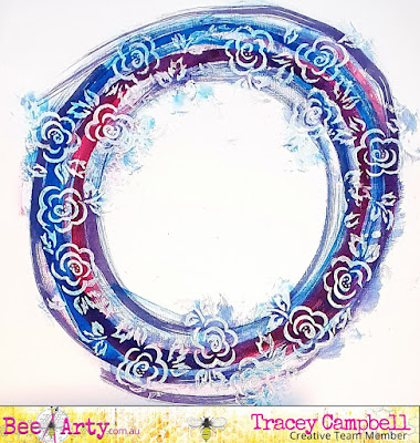
Here is what it looked like, I worked quite quickly to do this as I wanted the inks a bit wet still so that they would bled together to create a purple colour.
Next I added a splashes and splats of the artist ink to the page by flicking my paint brush at the cardstock and then letting bigger droplets fall. I also wanted purple splashes so I mixed a small amount of the Cranberry and Marine and repeated the flicking and droplet falling.
This is what it turned out like. I must admit at this stage I was looking at what I have created and thinking to myself that it was one hot mess and the though crossed my mind to put it aside. It really wasn't what I had in mind for the photo I wanted to use.
Once the Artist Inks were dry and I saw how vibrant they were, usually I love the brightness of the colours, but they were just too bright for the photo I wanted to use. I really didn't just want to discard what I had done so I decided to soften the colours by dry brushing some Heavy White Gesso, using a large thick brush, over the top of it all. I followed the circle image and worked the brush in and out in a circle, covering the whole cardstock. Tip: Dry brushing is done by just dipping the tips of a dry brush's bristles into the media and not applying it too thickly.
Here is what the softened background turned out like when dry. It was now exactly what i had in mind and I love how it turned out.
Next I fussy cut out the flowers from the Faith Patterned Paper in the Grateful Heart Collection, I also cut off the product strip and to use the poke-a-dotted side.
To put the page together I matted the photo with some purple, pink and blue patterned paper (I used some older papers that I have had for many year) adhere to the background. Using the same papers that were used to mat the photo, I tore the edges off to get 12 inch strips roughly 1.5 cm in width. I then layered these over the top of each other and adhered them to the left hand side of the cardstock, see the final layout for how this was done. Finish off the strip with the Faith product strip on top.
Using some 3 dimensional tape adhere the fussy cut flowers from the Faith patterned paper over the top of the right side of the photo and then a single flower in the bottom left corner.
For the finishing touches I used the Colour Blast Inspired Collection Pan Watercolour Set (if you don't have the watercolour set any water paint will do) to add some colour to small sticker words. I used the colour ultramarine from the set as it was the perfect colour to complement the toned down colours of the Artist Inks. To finish off adhere the coloured stickers to the page along with some small enamel hearts and dots.
I hope that I have inspired you to keep going with your layout, if it doesn't turn out how you first thought it would in your head, stop, look, work out exactly why it isn't what you want and think of a way to change it.


Beautiful page, Tracy!
ReplyDelete