Showing posts with label bright. Show all posts

Wednesday, 16 January 2019

"Right Here" scrapbook layout by Sue Plumb


Hi everyone!
Sue Plumb here to share my latest design team project with you. Today I have a mixed media scrapbook layout to share that I created using my very favourite Colour Blast product - Colour Artist Inks. I just love the bright, vibrant colours of the inks which were perfect for pairing with this photo of my boys with their friend. 


I began my page with a sheet of heavy weight white cardstock and a couple of Colour Shimmer Cubes - Blush and Apple Of My Eye. I wanted to create a simple watercolour background using a couple of contrasting colours.
(Unfortunately the Colour Shimmer Cubes have now been discontinued, but I am sure there are many of you who still have them in your stash waiting to be used. As an alternative, you could use Colour Shimmer Sprays in the same colours applied with a brush.)


To use the cubes, I first sprayed the surface liberally with some water, then left them to moisten for a few minutes. I then used a round brush to apply the colors over my background, starting with Blush applied to a few random areas, then moving onto Apple Of My Eye to fill in the gaps. I used extra water to keep the cube surface wet, and used a clean, wet brush to help the colours move around the page. 
It is important to ensure the pink is dry before moving onto the green, and take care not to overlap them, as this product is a watercolour and WILL reactivate (and pink + green = mud)

Once the shimmer cubes had dried, it was time to start applying some vibrant colour using the Colour Artist Inks. (As the inks are flat colours, I planned to overlap the shimmery colours from the cubes to reactivate them and supply some extra sparkle.) 


I started with Oasis, Cider and Slipper; and simply applied the ink like a watercolour paint using a small round brush. I dipped my brush into the water a couple of times as well, just to add some extra moisture to the page and help the inks move more. I applied each colour one at a time, tipping the page up vertically to create small colour runs, before drying it off. 

I then went back with more Colour Artist Inks (Citrus and Spice) to layer some extra colour over the top. I followed the same process as with the previous colours, tilting the page to create small runs and drying between colours. 


The next step in my process was to add some depth to my page with some stamping. I used the 'Sky of Stars' background stamp from Viva Las VegaStamps, along with black StazOn ink.


At this point I wanted to add some subtle texture to my page, and I also wanted to tie in the subtle green colour I had began my page with; so I used Apple Of My Eye Colour Paste, along with a stencil to add some whimsical style tree branches. (You can see the difference in the paste colour in the process shots between the wet vs dry product - it's much deeper and shimmery!)


After the paste had dried, I wanted to define the focal area of my page, so I added some black spotted tissue paper and some torn pieces of washi tape. I used a small amount of gel matte medium to apply the tissue, and I love the way the paper then "disappears" into the background, just leaving the pattern visible. 


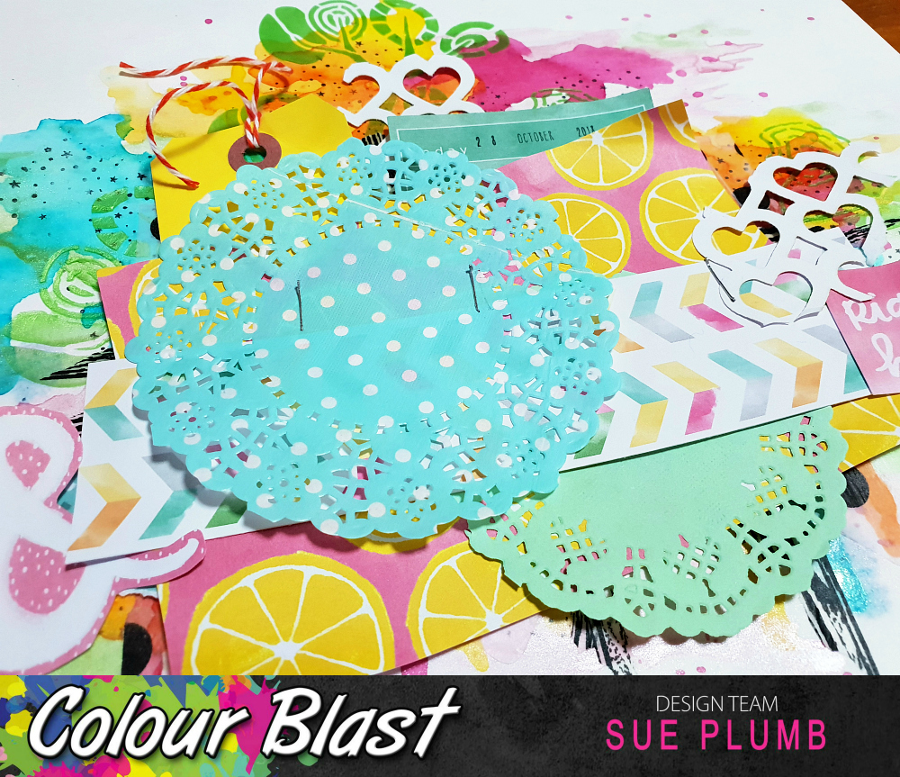
Now it was time for some papery layers. I wanted something bright to match my bright inks and photo, and I found some old Amy Tan papers in my stash that worked perfectly. I also added a couple of coloured paper doilies, a tag tied with twine and some left over pieces of a heart cut file. I secured all my layers in place using a stapler. 

To finish off my page I adhered my photo, a small journalling tag, and a few pieces from the coordinating die cut ephemera pack. 


I then added some small splatters of Calypso Colour Artist Ink. (I know that I usually reach for Soot, but I felt black would be too harsh in this case.)


You can see in the close up how the layers of colour work on top of each other to give the background depth.


I love how the small runs of inky colour extend out below the paper layers.


I couldn't resist but include the cute little acetate pineapple on this page (I had been hoarding it for FAR too long!)


That's all from me today. I hope I have inspired you to get creative - maybe play with some bright colours or pull out some inks and try an easy background like this too?
Until next time, happy scrapping! 


Wednesday, 6 June 2018

"Browser Brain" by Sue Plumb


Hi everyone!
Sue Plumb here with my latest design team project for you. Today I have an 8.5x11" scrapbook page to share using Colour Artist Inks and Colour Paste that was inspired by a recent quote I saw and shared on Facebook. As soon as I saw it I could totally relate to it, as it pretty much sums up my constantly over-active brain. And a busy brain filled with so many things could only be accurately depicted by a layout that reflects the same things, right?


Before I even bagan, I knew the only way to achieve the look I was going for was to use layers - lots of layers; so bear with me while I take you through my process. 
To start with, I grabbed white cardstock; book paper; music paper; and matte medium to create a collaged background. I also added some random stamping using assorted word and image stamps. (Stamps by Viva Las VegaStamps and Carabelle Studio.)
As I knew my page was going to be very busy, I made sure to leave enough white space around the edges for the viewers eye to rest.


The next step was to start adding some colour, so I grabbed for my favourite Colour Blast product - Colour Artist Inks, in the shades of Lime, Oasis, Calypso and Citrus.


I then sprayed my background with a mist of water from a spray bottle, before using the droppers to add drops of ink around the page. (Be sure to use complimentary colours, as they are going to blend.) My tip here is don't use too much ink or go too close to the edges of the page, as you want to preserve that white space! You can see how some of the inks began spreading immediately due to the page being wet.


Once I had added drops of each colour where I wanted them, it was time to start spreading the colour. I didn't want the colours being too vibrant or dominating on this layer, so I chose to spread them with more water. I did this by again using my spray bottle, and by holding the nozzle very close to each ink drop on the page I spritzed it once or twice with water. This not only diluted the ink, but also fanned the colours out to begin blending together. I also picked up my page and tilted it slightly in each direction to help the process along.
I then carefully placed it flat again and immediately dried it with a heat gun so I could preserve the integrity and placement of the inks. (You can see the hard water lines that form when you dry quickly using this method.)


Next, it was time to freshen up the page using some white heavy gesso. I didn't want the yellow tint of the book and music paper showing too much in the areas the ink hadn't touched, so I applied a little gesso with my fingertip to soften it. (In some areas I used a wiping motion with my finger, whilst in other smaller areas it was just a little dab.)


Now it was time to liven things up with some contrast and texture! I used the amazing Mandala Floral stencil from StencilGirl Products; and applied Royalty Colour Paste through it with a palette knife.


To ensure the stencil didn't move and ruin any of the intricate details, I used washi tape to secure it to my page before spreading the Colour Paste. This stencil measures 9x12", so I was able to use the entire design on my page, and it looked amazing when it was removed. 


At this point I thought my page needed another colour for some additional contrast; so I reached for Slipper Colour Artist Ink and applied some very fine splatters around the edge of my design using a small, stiff brush. I then used my heat gun to dry the entire page thoroughly before moving on.


The final steps in my process were to add the photo and embellishments to my page. I used a paper doily and some frayed gauze under my photo to help separate it from the background, as well as adding some cardboard behind it to pop it up. 
I added some twisted, coloured wire using staples; title alphas (using the natural flow of the stencil as a guide for placement); a Charms Creations chevron; my printed quote and a few enamel dots for some extra small pops of colour.


And with that, my page was complete!

You can see all the multiple layers at play here and also how I used the natural curves from the stencilled image to dictate the position of my title alphas. 


The bright yellow doily contrasts against the other colours and helps separate the photo from the background, whilst the chevron also helps draw attention to it.


Cutting the quote into pieces and placing them haphazardly rather than straight, also helped to reinforce the theme of the page. 


Thanks for stopping by today so I could share this with you. I hope I have inspired you to try your hand at creating your own multi-layered project.

For all my fellow Brisbane peeps - don't forget that the Brisbane Scrapbook & Papercraft Expo is on daily at the Convention Centre from Thursday 7th - Sunday 10th. The Colour Blast girls will have all your favourite products on sale (and some show specials too), so make sure you stop by the stand. 
If you see me wandering around on Thursday or Sunday, please come up and say hi!
Until next time, happy scrapping!


Wednesday, 28 February 2018

"Awesome" Scrapbook Layout by Sue Plumb


Hi everyone!
Sue Plumb here with my latest design team project for you. Today I have a 12x12" mixed media scrapbook layout to share featuring a fun photo strip collage of some photos I took of my daughter and hubby on a ride at an amusement park. I paired it with the 'You Rock' collection from Cocoa Vanilla Studio and (of course), Colour Blast products!


I loved the bright red colour of the ride in the photos so I wanted to use a vibrant red medium to match. Unfortunately, the Fire Engine Colour Paste was not quite the right colour I needed, so I used a tip I gained from the Colour Blast Creative Corner group, and mixed the paste with some Candy Colour Shimmer Dust. This gave me the perfect red shade I was after.


I then took my new red paste and used a palette knife to smear it across the focal area of my page.


I then used a small stiff brush to add some splatters of Soot Colour Artist Ink before drying it off with a heat gun and setting it aside.


The next step in my process was to add some depth to my page by adding some stamping. I used rubber stamps from Viva Las VegaStamps and Staz On ink to stamp directly over the top of my Colour Paste. (The paste takes the stamping really well, providing you ensure it is completely dry first.)


After I had added the stamping, it was time to add some papery layers to my page. I used various papers from the 'You Rock' collection to create a layered photo mat, which I secured with staples before adding my photos on top.


After my photo strip was in place, I added some small pieces of torn washi tape, and coordinating 'You Rock' embellishments before I decided I needed some extra red. I took my Sunburnt Colour Artist Ink and added a few splatters around my page.


Here's a closer look at some of the details...


I love the shine and the extra vibrancy of the paste with the Colour Shimmer Dust mixed in.


I love the dramatic combination of the black / white / grey / red together.


How cute does that rubber charm tag look tied with the bit of twine? A simple way to add some texture to a page.


If you haven't tried stamping over your dry Colour Paste before, I highly recommend you give it a try - you can see how effective it looks!

That's all from me today. I will be back soon with another project to share. Until then, happy scrapping!


Friday, 1 September 2017

Love You Everyday by Kasia Leach

Hello again lovelies.. Kasia here with a layout this time.


I am kick starting this month of with a brand new challenge which is a super fun one. You get to dig out some of your favourite stamps and crack open your Colour Embossing Powders & Colour Mica Powders.  

I must say it was a bit of a challenge for me as my first thoughts went straight to stamping a background with Versamak ink and heat embossing it with an awesome colour and then painting the detail with the Colour Mica Powders and this would look fab on black cardstock, but I resisted and chose to play instead. 


The giant title was inspired by all the colours of Colour Embossing Powders available and my inability to choose just one. 


I cut the title on our laser cutter at work, but you can cut it on a Silhouette.. just a nice big word will work. I positioned it in my stamp platform and used a sprinkling hearts background stamp to add some interest to the word. 


I focussed the condensed hearts on the bottom of each letter..


and masked the joins of the letters with post it tape so that the stamping flowed nicely across the title. 


Here is what the final title looks like.


I chose to create a blend of Colour Embossing Powders in the following colours: Just Blue, Deep Water, Envy, Apple of My Eye & Sunshine. 


I then stamped one letter at a time with Versamak ink and sprinkled on the Colour Embossing Powder and heat set it before moving onto the next colour. 


If the word was smaller you could add all the colours of Colour Embossing Powder and heat set at the same time, but I chose to do one colour at a time so that I could save the excess and pour it back into my pot without having it mix with the other colours. 


When moving onto the next colour, overlap it a little with the previous colour so they blend when you are melting the powder. 


If you don't get a great blend the first time, you can stamp some Versamark at the join and sprinkle both the colours on the join and melt them together. 


I then mixed a little Polar, Cool Mint & Lemon Zing Colour Mica Powder with some water in spray bottles.


I sprayed a generous amount across a 12x12" piece of smooth white cardstock overlapping each colour a little. I wanted the Lemon Zing to be a little brighter so I added a tiny amount of the Paris Colour Shimmer Dust and sprayed again. 

I let the colour move freely as I heat set it and I just love the result.  I then added a few flicks of the mixed Colour Mica Powder above and below the main body of colour. 


I matted my photo with a couple patterned papers from older Crate Paper & Pink Paislee collections. 


I gathered a few embellishments in coordinating colours from my stash and added them around the photo


I then finished off the layout with a generous amount of black stamping to help frame the photo. 


Hope you enjoyed my process and give a few of the techniques a go.. It's a good excuse to dig out some of your old stamps too :) Don't forget to join in the challenge this month too. 


xx 
Kasia