Showing posts with label Colour Blast. Show all posts

Saturday, 7 January 2023

2023 ATC Coins I Mixed Media I Sunila Mahajan

 Hello Bee Arty Lovelies,


Wishing you all a fantastic 2023! Sunila here and I'm back with a mixed media pictorial for you all!

Today I'm creating mixed media style ATC coins that I can share with my friends at the start of this year. 

Here's a look at them:


Let's dive into the process:

1. I started out by cutting three circles measuring 2.5" on white mixed media paper. I coloured these with Slipper Artist Ink.


2. I added colour paste through a stencil for contrast and texture.


3. I stamped a background stamp with black ink for more texture.


4. I stamped and heat embossed elements for layers. I then fussy cut these. 


5. I tested a few artist inks, and then die cut 2023 for the layering.


6. I added some die cut and fussy cut words to complete these. I mounted them on black card stock with a scallop border. 


Here's a closer look at them:


Hope you enjoyed this and are inspired to create your own ATCs. For more inspiration follow me on Instagram- www.instagram.com/sunilamahajan

Supplies used:


Saturday, 18 June 2022

Masculine Wallet Card by Sunila Mahajan

 Hello Bee Arty Lovelies,


Sunila here, and I'm back with a fun pictorial for you'll. Today I'm using the Chit Chat collection for a paper crafting project. When it comes to making Masculine cards, it's a challenge for me. So today I thought of trying out a different idea, and I created a Wallet style card. This is a unique greeting card with space for a gift card/voucher/money. 

Here's a look at it:


Let's dive in, into the process of creating this.

Step 1:
Cut a piece of pattern paper at 10 3/4" x 3 1/2"


Step 2:
Score on the long side at 4 1/2", 4 3/4", 9 1/4" and 9 1/2". Rotate to left and score on the shorter side at 1 1/4" and 2 1/4" until the second score line. This is our base piece.


Step 3:
Cut another piece at 9 3/4" x 3". Score on the long side 1/4", 4 3/4", 5" and 9 1/2". On the short side score at 2 3/4". This is our first pocket piece.


Step 4:

Score and burnish the base piece and trim off the two shorter squares along the side as shown in the image below.


Step 5:
On the first pocket piece, cut the smaller square along the middle score lines, and the 2 corner squares. 


Step 6:
Time to glue the two pieces together. Place the pocket piece over the base. The middle score lines should align. Apply glue onto the side and bottom flaps and glue it to the base. This gives us a nice pocket for notes. 


Step 7: 
Cut three pieces for the inserts measuring- 2 1/4" x 4 3/8", 1 3/4" x 4 3/8" and 1 1/4" x 4 3/8"
Adhere tape along one long side and both shorter sides, stick them on top of each other to form the three pockets on the left inner side of the wallet.


Step 8:

Cut another piece measuring 2 3/4" x 4 3/8" . I then used a rectangle stitch die smaller than the piece to cut out a window. This creates a see through pocket for the inner right side of the wallet. Adhere tape on the bottom and the two sides and stick it on the wallet.


Step 9:

Fussy cut elements from the paper pack, and decorate the front. For the closure, you can use magnets, or velcro. I simply created a slit and inserted the flap in. Cut out elements and insert in the pockets, along with the gift card or a photo. 


I've used the Chit Chat Collection for this project. 

Hope you enjoyed this project!
Hugs,
Sunila


Saturday, 5 June 2021

Never Give Up On Yourself by Tracey Campbell

 Rainbows and Butterflies! What more could a girl ask for? Good day lovely people, Tracey here with you to share a fun and bright layout that is simple to make and looks lovely when finished. It brings a smile to my face when I look at it and I hope it does to you too. 

For this layout I gathered the following Bee Arty products:

Artist, Vision and the wordsheet from the patterned papers of the Arty Farty Collection

The cover sheet of the Love and Grace Collection 

The Serendipity stamp

Colour Artist Inks in the following colours; Sunburnt, Spice, Citrus, Lime, Slipper, Mermaid and Calypso, 


I created the butterflies first by stamping with Stazon Black Ink onto some velum. Tip: Stazon takes around 20 minutes to actually dry on velum so put it aside somewhere you won't be tempted to start working on the colouring until it is fully dry. 


Draw some arched lines across the Artist patterned paper, try and keep the arches in roughly the same colour sections as these will be used to create the rainbow.


Cut the arches from the Artist paper.


Group the strips in a shape of a rainbow, making sure that you have one at least one line to represent each colour in the rainbow colour spectrum. Adhere them to the Vision pattern paper.


I know that I really love a range of papers when I am looking at the title/advertising sheet of the collection and contemplating using it for my layout (as the old saying goes; waste not, want not). I did actually fussy cut the flower and bird clusters from the cover sheet for this layout - but if you have any of the Love and Grace papers left just use those to fussy cut. 


Next up was colouring the velum butterflies. I used a paint brush and the Colour Artist Inks to do little sections at a time. 


I took my time to colour separate sections as I did not want the inks to run and blend together. I was trying to get a stain glassed window effect. It took awhile but I eventually got the butterflies coloured and let them to dry. The ink does not go on to the velum very well, it tends to pool together away from the Stazon Ink leaving a white edge but I did find that when the ink was also dry you could spread it out more.


I finished the layout by matting a 4x6 inch portrait photo with white cardstock and adhering it to the bottom of the rainbow. I then placed a butterfly behind the top right hand side of the photo and the other one to the left of the paper so that it looks like it is flying off the page. I then finished off with the fussy cut bird and flower clusters, the title and some journaling. 

I hope that I have brought a little brightness to your day.

Hugs
Tracey


Saturday, 22 May 2021

Do What Makes Your Soul Shine by Tracey Campbell

Hello lovely people, Tracey here today sharing a fun and quick layout using a few different collections. One of my favourite colour combinations is black and white with just a splash of one other colour, it is very classical and can be used for a huge variety of themes. 

So I thought I would see what I had in my Bee Arty stash that I could work with and discovered that quite a few of the collections have black and white prints. 

So this is what I gathered to work with:

Positive patterned paper from Fearless Brave and Free Collection

Hope patterned paper and Gathers cut-a-part sheet from the Grateful Hearts Collection 

Follow Your Dreams Collection for patterned paper and for the Title the Seeker Word Sheet from the same collection.  

Smitten from Vampyre Rose Collection

My first step was to create a black and white background, to do this I cut a 8x12 inch piece of Positive from the Fearless, Brave and Free Collection and two 2&1/2 inch strips of Smitten from the Vampyre Rose Collection. Using the 1/2 inch on the Smitten paper I applied some double sided tape and adhered Smitten to the Positive paper to create a 12x12 inch background.

Next I fussy cut the flowers and the doily from the Hope patterned paper in the Graceful Hearts Collection, I also cut the lace doily out from the Gathers pattern paper in the same collection.

With the fussy cut flowers and lace I adhered them running down the left and right side of the Positive patterned paper with some 3 dimensional tape to give height or white glue.

Now for a pop of colour, I sprayed Punch Colour Shimmer Spray into the center of the Positive patterned paper. The photo below shows much I sprayed.

Let the Shimmer Spray dry.

White the Shimmer Spray was drying I fussy cut the title "Do What Makes You Soul Shine", a mandala, butterflies and two of the spotted trimming strips from the Follow Your Dreams Collection. 

Using some of the patterned paper from the Follow Your Dreams Collection I matted a 4x6 inch portrait photo, then finished of the layout by off setting the photo to the left on the base and adhering the title, mandala and the butterflies to the right side. I also added the spotted trim down the join where the Positive patterned paper meet the Smitten patterned paper and the fussy cut flowers. 


One of the many things that I love about the Bee Arty Collections is that they are so versatile and all seem to compliment each other and when combining them together you create a whole new look and feel to them.

Thanks for stopping in today. I hope that I have inspired you to give a classical black and white (with a pop of colour) layout a go. 

Hugs
Tracey

Tuesday, 18 May 2021

Together With you by Tracey Campbell

Greetings and salutations Arty Bees, it is my turn on the blog today and I wanted to try my hand at the monthly Mood Board. I thought that it would be a good challenge as it is certainly not my unusual colour combination that I would put together.

So this is what the May Mood Board looks like; 

The first thing I did was riffle through my Colour Blast by Bee Arty papers to see what I had that would suit. I found some left over pieces of Hope from the Grateful Hearts Collection, Luca from the Love and Grace Collection, Paradise from Life's A Beach and Ideas from the Arty Farty Collection that I thought fitted the colour palette of the Mood Board. Next was looking at the mixed media and choosing Colour Sprays in Sunshine, Tangerine Dream, Punch, Bubblegum and Lagoon. Colour Shimmer Dust in Midnight. Colour Paste in Punch (I didn't end up using the Colour Paste). Citrus in the Artist Inks.

As I only had a few pieces to work with I decided to create my own background to match, so I had a play with the mixed media to see if I could recreate the beach. I started by using Heavy White Gesso to coat a piece of 12x12 cardstock. I knew I would probably layer up a few different mixed media elements so I wanted a good base to work on. Once the Heavy White Gesso was dry I sprinkling some of the Midnight Shimmer Dust across the top of the page. 

Usually I activate the Shimmer Dust with water but as I wanted the dark blue (Peacock) that fades into a lighter shade of the blue (Peacock) I decided to activate it with Lagoon Colour Spray. I actually did this while I had the cardstock on an angle so that the liquid would blend and run down the page.  

Here is how the Midnight Shimmer Dust and the Lagoon Colour Spray turned out. Put aside to dry.
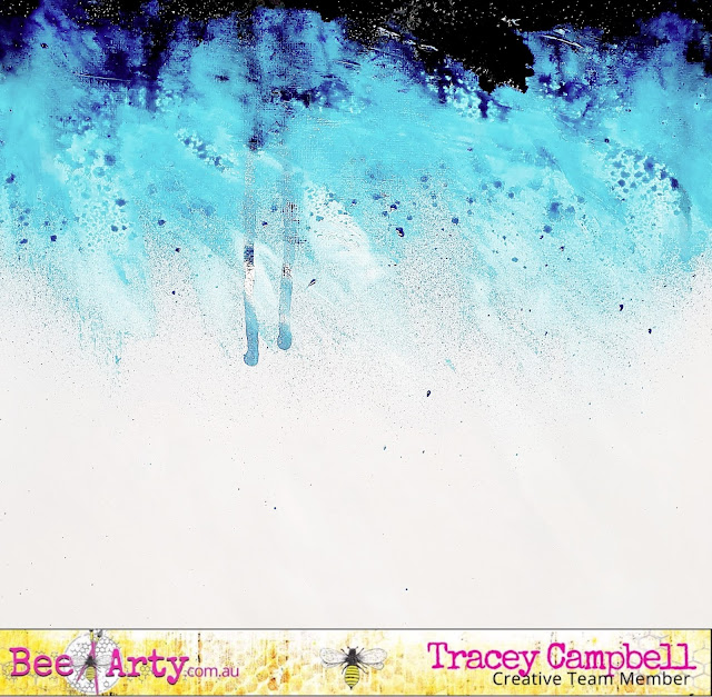
Now for the Blush and Peach Nectar, I didn't quiet have the right colours so I decided to have a bit of a play to mix my own. In a little mister bottle I mixed some Heavy White Gesso with a bit of water to thin it down and then added tiny amounts of Tangerine Dream and Punch Colour Spray together to create a light Blush colour. In another mister bottle I put in a touch of Bubblegum Colour Spray, a drop of Citrus Colour Artist Ink with the watered down Gesso for a Peach Nectar colour. It did take awhile to get the colours right, I just kept adding a tiny amount of colour at a time and spraying onto a scrap of cardstock until I got it right.

I then sprayed the Blush and Peach Nectar colours onto the cardstock with the Peacock blues on it. If I did this again I would do the Blush and Peach Nectar colours first then the Peacock as it kept reactivating when I sprayed it. But I am happy with how it turned out. 

While the background was drying I used the Desire Metal Die to cut out two images from Hope (Grateful Hearts Collection) and six images of vines from the Metal Die set String Leaves using the blue woodgrain pattern from Paradise (Life's A Beach Collection).

I cut the patterned papers into various sized rectangles and layered them to create a large mat for my photo. 


Once happy with the layering I adhered it to the background and added the die cut images around the photo, see the photo below for the positioning. 


Using the Metal Dies 365 Alphas I cut out the main word for my title from some yellow patterned paper. Which I glued on the left hand side of my layout, I did  add a few other letters from some foam Thickers.


I finished off the layout with some peach and peacock paper flowers then doodling and splattering with a white paint pen.


Here is the final layout, it is a bit different than my normal work, but I love how it has turned out and think that it is a good representation of the May Mood Board. 


Thanks for popping in and I hope that I have inspired you to try your hand at the Mood Board. Let me know if you give it a go, I would love to see what you come up with.

Hugs
Tracey