Showing posts with label colour spray. Show all posts

Sunday, 6 March 2022

Roses and Iris's - With Karyn Schultz!

 Hi Bee Arty Lovelies!

It's Karyn here and today I have a scrapbook page to share with you made using products from the new Fireworks collection from Bee Arty. 
 
   
I was inspired by the colours of the February mood-sketch challenge. 
 
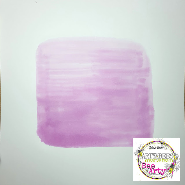
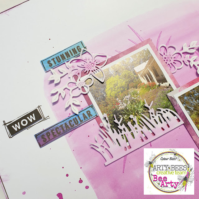
I created a background on 350gsm Heavy White Cardstock by painting an 18cmx18cm square using Grape Colour Spray mixed with water in a paint palate and a large flat brush. I've created an ombre effect being darker at the bottom and lighter at the top. 
 

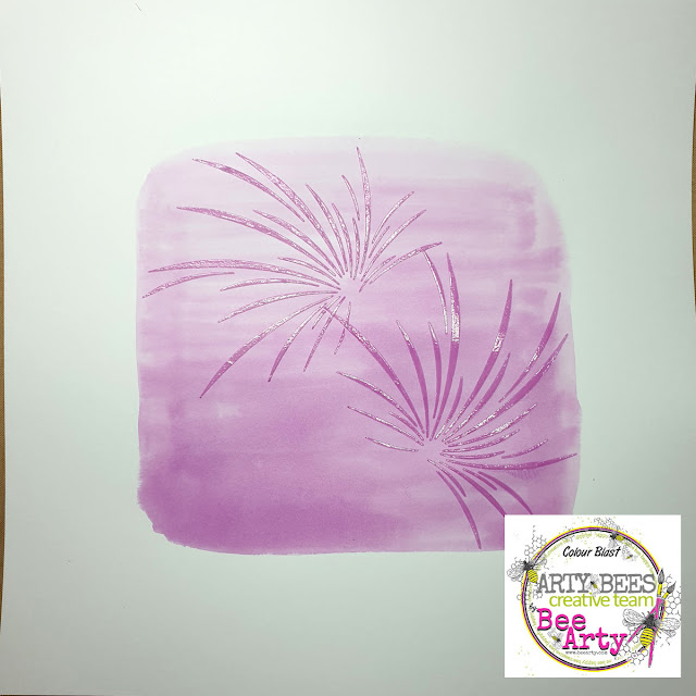
I mixed 4-6 drops of Grape Colour Spray with 1-2 tablespoons of heavy gloss gel then used a palate knife to apply through the Fireworks stencil from the Fireworks collection.  
 

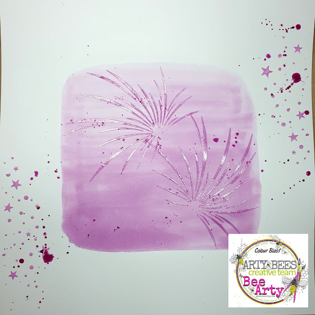
I applied more of the Grape / gloss gel through the star section of the Fireworks stencil in the top right and bottom left sides of the page.   

Once dry I added splatters of Grape Colour Spray.
 
 
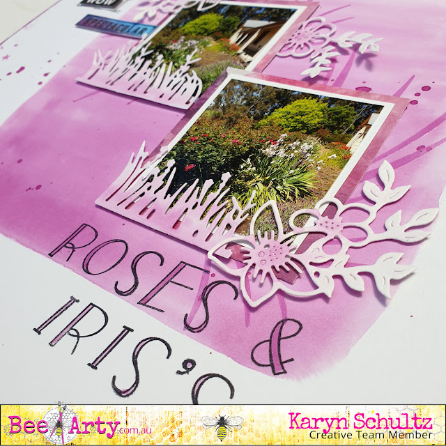
 Here is my completed page.
 
 
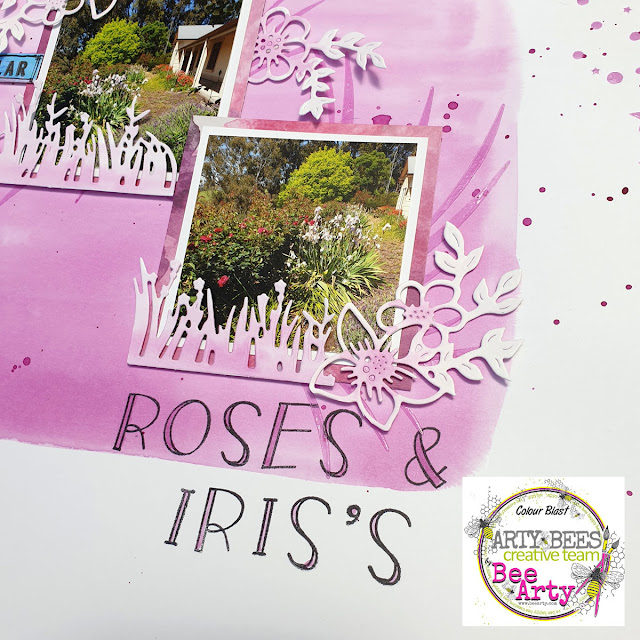
 My photos are 7cmx7cm including a white border. I've matted these with 8cmx8cm Sparkles paper from the Fireworks collection then adhered to the page. I've used diecuts from the grass die from the Forest Favourites metal die set and the Sweet Floral metal die. All die cuts are created using 250gsm white cardstock and are painted using the Grape Colour Spray.
 
 
I've used words cut from the Colourful paper from the Fireworks collection and alpha stamps from the Uppercase stamp set. Lastly I've outlined my page using a fine black Life of Colour paint pen.


Thanks so much for stopping by

Crafty Hugs xx


Sunday, 21 November 2021

Be Fearless with Belinda Spencer

 Hello Arty Bees!!


It's Belinda here with you today to share my latest layout featuring the stunning Fearless, Brave and Free Collection by Fiona Paltridge.


I started my layout by cropping a sheet of the Positive patterned paper and mounting it on a sheet of the fabulous 350gsm White Cardstock. I love to have a border around my page and also I love the sturdiness this double layer gives. 


Next I grabbed the beautiful Indigo Colour Spray and spritzed some of that on the background. I titled my page and let some drip down in the area where I knew my photo was going to be. The background design on the paper was so nice that it didn't need too much added to it. I didn't want to obliterate what was already there just add a little bit more to it.


Once the layout was dry, I then added some stencilling using the Ecliptic A6 Stencil with Snow White Colour Paste. I applied the paste through the stencil using a palette knife. 
I added some stamping too using the Say It Clear Stamp Set with Archival Ink.


I fussy cut some images from the Fearless, Brave and Free Collection patterned papers. I also used the String Wreath and the Create Metal Dies to add more layers behind my photo. I used the Create die with patterned paper as well as with the white cardstock. One of the die cuts I sprayed with the Indigo Colour Spray. I then layered them together behind my photo.


Finally I added my embellishments, title and quote.

Here's what I used:


Metal Dies:


Thanks so much for stopping by the blog today.

Cheers
Belinda


Friday, 20 August 2021

Life is Better with ART in it by Charmane Koch

 Love my title? Life is definitely better with ART in it! Especially these days! It definitely has helped me through tough times! Nothing better than some "Art Therapy"!

Looking at ART makes me happy too! I am loving the Street Art around Adelaide that I have been seeing as we explore our own city!

Today I am sharing with you a layout that I have been slowly creating over the last few weeks...

I wanted to create a similar feel to the actual photo of Street Art that I happened to find while walking past a backstreet in Adelaide!

I started off by colouring White Gesso with Rainforest Colour Spray, I have then used the Drifting Leaves stencil around the 4 corners of the White Cardstock. With the left over Gesso I have smeared with a palette knife lightly over the rest of the page. I have then dried using a Heat Gun.

Next I have then used a palette knife to stencil the Rose Reveal Stencil with White Gesso...

I've waited for that to dry naturally {or I was too busy and couldn't continue!}

Meanwhile I have torn some cardboard from a box and painted with Gesso to use as a backing to my photo.

After that I have decided to use the Brickwork from the Pavement Stencil in the middle of my page to create the similar brickwork on the wall. I've used White Gesso again & dried with a Heat Gun.

Once everything has dried I have slowly coloured the Rose Reveal Stencil using Apple of My Eye & Blush Mica powders with a splash of water. I have also used Leather Mica Powder to colour the brickwork. This has been done in layers until I was satisfied with the colours.

I also stamped using the script on the Bokeh stamp lightly over the top in places on my layout to create a "graffiti" effect like on the door of the photo.

I have doodled around the edges of the stencilled background, so that the images are highlighted a bit more.

I have layered the photo using the cardboard, I coloured part with the left over Apple of my Eye Mica powder.

I have then added a swirl of kitchen string and flowers to add extra interest. And of course a Charms Creations Heart to match.

Thanks for popping by, I hope I have inspired you to create your own background using a stencil or two ;)

XO Charm


Saturday, 14 August 2021

Dream, Believe, Achieve by Tracey Campbell

Hello everyone, Happy Saturday. Today I am sharing my latest creation using the Find Paradise Collection by Fiona Paltridge, it a lovely collection that has soft touches of pink/peach and minty green shades. Perfect for those dreamy photos of photos of your favourite holiday in a tropical setting. 
I've picked a photo of my oldest daughter Bronte and one of her friends that she doesn't get to see very often but when they do meet up it is like that just saw each other. A sign of a true friendship.

Dream, Believe, Achieve


I wanted to add a contrasting colour to the beautiful colour scheme of Find Paradise so that it would pop out. I had no idea of which colour to use so I decided to look at a colour wheel and see what the triadic colour would be. A triadic colour scheme is comprised of three colours evenly spaced on the colour wheel (you can also use the in-between hues). Because of the strong contrast, a triadic palette is generally quiet dramatic, but by using toned down shades it cuts the colour down to manageable (visually pleasing) levels.  In the wheel below you can see that the peachy/pinks would sit in the "Orange" triangle - I think about hues 2 and 5. The mint/green would sit in the "Green" triangle - hues 9 to 7. So I looked at the triadic colour and looked at the Violet and Blue Violet colours - at first I was thinking the higher number hues 6 - 9 but as I was playing around with colours I decided to go with an extreme contrast. So I picked a Blue Violet colour with the hue of 1. I like how it has turned about, you will have to let me know what you think. 


After I picked the contrasting colour I went through my Bee Arty Colour Blast products to see what I had and found. I found Just Blue and Royalty in the Shimmer Cubes and Indigo Colour Spray. I cut out three of the larger floral blooms from the Botanicals patterned paper and painted them with a waterbrush with the Just Blue and Royalty in the Shimmer Cubes and Indigo in the Colour Spray.


Next I fussy cut the peach blooms, 3 of the palm leaves and the painted large blooms from the Botanical patterned paper.


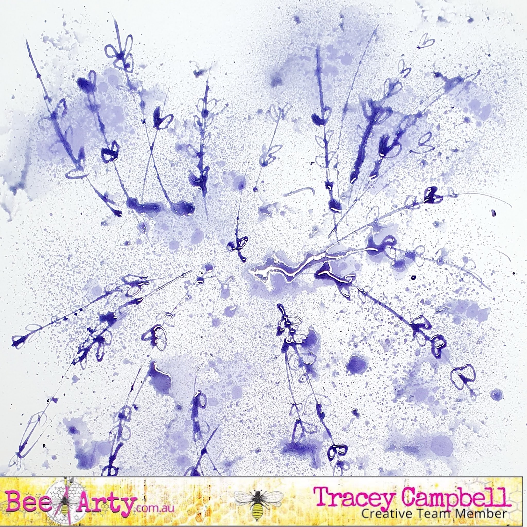
I wanted a pieces of paper the same as my contrasting blooms are, but didn't have any so decided to create my own. First up I sprayed some Indigo Colour Spray onto a piece of white cardstock, I wanted a fine spray and a large dotty/splatter look and to do this I sprayed the cardstock normally a few times, which creates the fine spray. Then I pushed the head of the spray very slowly, this techniques gives you larger drops/splats of stray.  


At this stage I didn't like how it looked so while it was still wet I used the plastic packaging technique to spread the larger splats out.


I then took the head off the Indigo Colour Spray and used the straw to draw random lines on the cardstock and then little leaves on the lines. I was copying the look of the lines in the wreath on the Mystic Garden pattern paper. 


Here is what is the cardstock for my mat turned out like.


Once dry I used the contrasting cardstock to mat the photo.


I decided to actually use the Mystic Garden pattern paper as the base of my layout but once again decided I need to add the contrasting colour. So I grabbed the purple Life of Colour paint pen and mimic the look of the wreath in the design. I drew large purple circles and then added a few little leaves and dots.


Here is what it looked like after I had finished mimicking the wreath. 


Next I adhered the matted photo down, however before i did I wanted to soften it a bit so I added tissue paper behind the matted photo. 


I still thought that the design was still too hard so I added some bandage fibers to the base to soften it and add texture.


To adhere it I used some Dimensional Magic in drops so that they formed clear balls that mirror the look of an acrylic dot. Here is a close up. Tip: make sure that you leave them long enough to dry (I left mine over night) or they can smudge. 


Next I arranged the fussy cut blooms and leaves over the left side and bottom right corner of the layout. 


I used 3 dimensional tape to add depth and adhere the fussy cut images to the page.


To finish off the page I fussy cut a title from the Breath pattern paper and adhered just off the top right hand corner of the photo. 


Here is the final layout. I really like the colour scheme, soft with a touch of pop.


I hope that I have given you some ideas and inspiration. 

Hugs
Tracey


Monday, 12 July 2021

STEAMPUNK PAPER DOLL by Linda Pearson

 Hi Crafty Bees! 

Linda here again with a mixed media project using a few components from the new Embrace Change collection designed by Fiona Paltridge.  Also I have incorporated the new amazing 'paper doll' process recently released by Michelle Grant Designs using some stamps and stencils from previous Bee Arty MGD collections.  I hope you enjoy the process of bringing the talents of these two amazing Bee Arty designers together ... enjoy!

BEE ARTY products used in project:
-   Embrace Change collection pack – designed by Fiona Paltridge
§ Perfect petals clear stamp set
§ Garden poem A6 stencil
§ Festival 12x12 scrapbook paper
§ Spice 12x12 scrapbook paper
§ Living 12x12 scrapbook paper  cut out sheet
-   Limited Edition clear stamp set – Time flies collection design by Michelle Grant designs
-   Scripted A5 stencil - Love and Grace collection designed by Michelle Grant Designs  
-   White Cardstock 350gsm  12"x12" 1 sheet
-   Embossing powder – bling, dusty charcoal
-   Shimmer dust  - lush and cobalt (dress),  velvet (hat),  passion and cobalt (wings)
-   Colour Spray  - mocha (watered down)
-   Colour artist inks  -  Marine (wings - watered down)
-   Black stabilo pencil
 
-   Sentiment words (washi tape)
-   Heat tool
-   Adhesive
-   Black archival ink pad
-   Watercolour paints / scribble sticks or equivalent


Stamp the Steampunk girl (Limited Edition clear stamp set) lengthwise onto a piece of White Cardstock 350gsm paper using embossing ink, sprinkle Dusty Charcoal Embossing powder over the stamping then activate powder using the heat tool.


Lightly draw a curvy body shape under the stamp, cut out shape, full length of card.  


Cut out a butterfly shape from the Living 12x12 scrapbook paper  cut out sheet.  Mix a little water in some Colour artist inks  -  Marine add a little Shimmer dust  - passion and cobalt to the ink then dab onto the butterfly wings to colour.  Allow to dry.


Mix a little water in some Colour Spray  - mocha (watered down) add a little Shimmer dust  - velvet to the Colour Spray  - mocha (watered down as before), paint in the hat using this mix.  Allow to dry.  Use water colours or scribble sticks to colour the face and hair.


Place the paper doll shape on the Living 12x12 scrapbook paper trace around the body shape then cut out and adhere to the front of the paper doll.


For the dress add Shimmer dust  - lush and cobalt to Colour Spray  - mocha (watered down as before), with a paint brush drizzle the shimmer mix over the dress shape and the collar.


Fussy cut the floral section from the Spice 12x12 scrapbook paper then adhere this to the Festival 12x12 scrapbook paper.  Add stencilling over the background Garden poem A6 stencil and Garden poem A6 stencil apply black archival ink through the stencils randomly over the page.


Add some stamping over the body shape using the chain stamp from the Limited Edition clear stamp set and the Scripted A5 stencil  .  Add some wording (washi tape in this project) to the page.  Adhere the wings to the shoulders.  Adhere the paper doll to the background sheet, bottom of shape tucked in at the bottom under the floral cut out shape (Spice 12x12 scrapbook paper).
Add shading around the shape using Black stabilo pencil blended. 
To finish off add some Embossing powder (bling) using flower and leaf stamps (Perfect petals clear stamp set), heat set to activate the powder.  Add black border around the page with Black stabilo pencil.

Thank you for stopping by and hope you enjoy this project as much as I had creating it.


project by Linda Pearson
linda@yourcreativepalette.com.au